7 common mistakes in logo design
A good logo is simple, memorable and legible at any size. These seven mistakes strip a logo of those qualities and make the brand look weak.
1. Too much detail
Thin lines, many elements and small text may look good on a big screen but disappear on a profile picture, favicon or business card. Try the logo at 32 pixels; if it is still recognizable, you are on the right track.
2. Chasing trends
A period's popular effects, gradients or typefaces look dated within a few years. Look for a timeless solution, knowing the logo will be used for years.
3. Not working in one color
A logo has to drop to one color for stamps, single-color print, engraving or dark backgrounds. A logo that depends on color loses its meaning in these cases.
4. An illegible typeface
Overly decorative or very narrow typefaces make the brand name hard to read. If the name cannot be read, it will not be remembered.
5. Looking like competitors
Sector clichés (a roof for construction, an arrow for consulting, a circuit for tech) make a brand invisible in the crowd. Put competitors' logos side by side first, then choose a direction that stands apart.
6. No variations
A single horizontal logo does not fit everywhere. Horizontal, vertical and symbol-only versions let the logo be used correctly everywhere, from the website to a social profile.
7. Treating the logo apart from the identity
A logo does not carry the brand alone. Designed together with a color palette, typography and usage rules, it becomes part of a strong identity.
Testing a good logo
Simple tests to evaluate your logo:
- Shrink test: is it recognizable at 32 pixels?
- Black and white test: does it work without color?
- Memory test: show it for 5 seconds and ask someone to draw it; do they remember the main form?
- Competitor test: does it stand apart next to competitors' logos?
- Application test: how does it look on a sign, a business card and a social profile?
What should the logo process look like?
A good logo process does not start with drawing. First you understand what the brand wants to say, who it speaks to and how competitors look. Then several directions are sketched and the strongest are tested on real applications. The chosen direction is refined, variations are prepared and usage rules are written. This prevents endless taste-based revision rounds.
How to give feedback on a logo
Tie feedback to goals rather than personal taste. Saying "Could this color feel too young for our audience?" instead of "I don't like this color" helps the designer solve the problem. Collect feedback through one person; conflicting comments from many people lengthen the process and weaken the result.
How long does logo design take?
How long a logo takes depends on the scope of the work and the speed of decision-making. A logo-only project and a corporate identity project that includes a colour palette, typography, variations and usage guidelines do not finish in the same time. What affects the timeline most is often not the design itself but how clear the brief is and how quickly and consistently feedback is given. In companies with several decision-makers, approval rounds can stretch the process. For a realistic timeline, agreeing on the stages and each stage's delivery date at the start of the project sets clear expectations on both sides.
- Scope: logo only or full identity?
- Clarity of the brief and need for research
- Number of alternative directions presented
- Number of decision-makers and approval speed
- Number of revision rounds
Which type of logo suits your brand?
Choosing the right logo type is the first step in avoiding mistakes, because each type answers a different need. If the brand name is short and distinctive, a text-only logo is a strong choice. For long or hard-to-pronounce names, a monogram made of initials can work well. A symbol or icon represents the brand on its own in small spaces such as app icons and social media profiles, but it takes time for a new brand to be recognised by a symbol alone. That is why many brands choose a combination logo that pairs a symbol with the name, and start using the symbol on its own as recognition grows.
- Wordmark: the brand name set in custom typography
- Monogram: a logo made of initials
- Symbol or icon: a standalone mark without text
- Combination mark: symbol and name used together
- Emblem: text placed inside a shape or badge
How do you write a logo design brief?
A good brief prevents most of the mistakes above on day one. Instead of giving the designer only the company name and your favourite colours, explain why the brand exists, who it speaks to and how it wants to be perceived. Share your competitors and examples you like or dislike, with reasons; writing why you like something, rather than just "I like this", sharpens the direction. Also state where the logo will be used most: signage, packaging, an app icon or a social media profile each bring different technical requirements. A short but concrete brief reduces revision rounds and speeds up the process.
- Brand story and values
- Target audience and desired perception
- Competitors and position in the sector
- Examples you like and dislike (with reasons)
- Main areas of use
- Existing elements that should be kept
The risks of making a logo with AI or ready-made templates
AI tools and ready-made logo templates offer a quick start, but they have serious limits for a brand's long-term identity. Because templates are used by many businesses, they raise the risk of looking like others and weaken distinctiveness. AI-generated images are often not vector files and may not work at small sizes or in one colour, so they carry many of the mistakes in this article from the outset. It can also be harder to register a mark whose originality is unclear as a trademark. These tools can be useful for generating ideas and exploring directions, but the final logo should be designed for the brand, drawn as a vector and tested in real applications.
Example project: four logo options for Lotis İnşaat
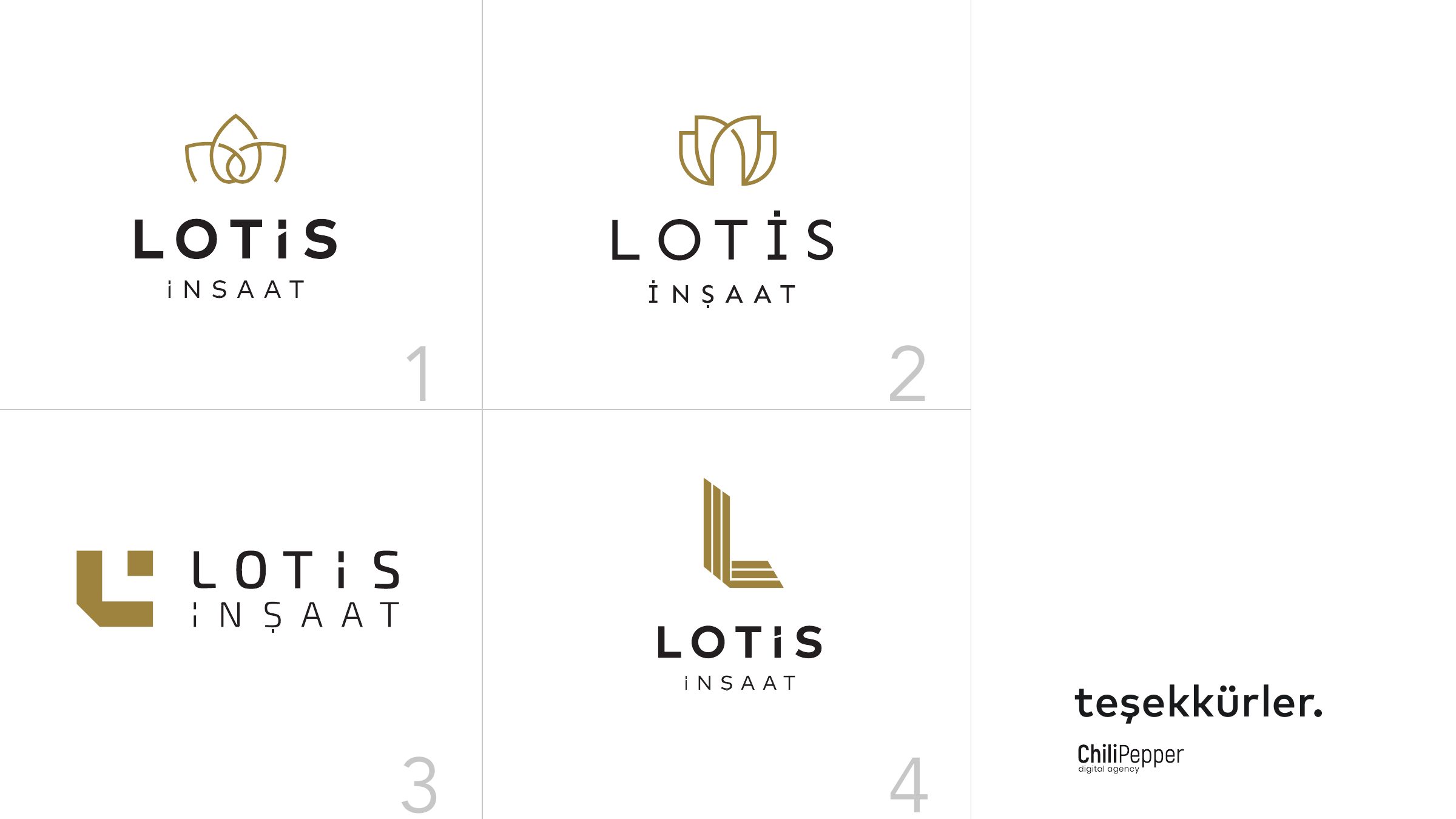
In Lotis İnşaat's logo presentation we showed four options under the same conditions: on light and dark backgrounds, on a hard hat, a sign and a building facade. This avoids many of the mistakes in this article from the start. The logo is tested small and in one color, its real-world use is visible, and the decision is made on application rather than taste. Directions drawn from the lotus flower and the letter L let different readings of one idea be compared side by side.
Frequently asked questions
Which file formats does a logo need?
Vector formats (AI, SVG, EPS, PDF) for print and scaling, and PNG for digital use, with light and dark versions of every variation.
How many colors should a good logo have?
There is no strict rule, but one or two main colors are usually enough. What matters is that it also works in one color.
Should a logo be registered as a trademark?
Registration is recommended for a logo you will use for a long time. In Türkiye, trademark applications are filed with TÜRKPATENT; running a search for similar marks before finalising the design reduces the risk.
Who owns the usage rights to a logo?
It depends on the contract between the parties. At the end of the project, it should be stated in writing that the usage and economic rights to the logo have been transferred to you.
How many logo alternatives should you see?
There is no fixed number. What matters is that the alternatives are genuinely different directions rather than repeats of each other, and that they are shown in real applications.