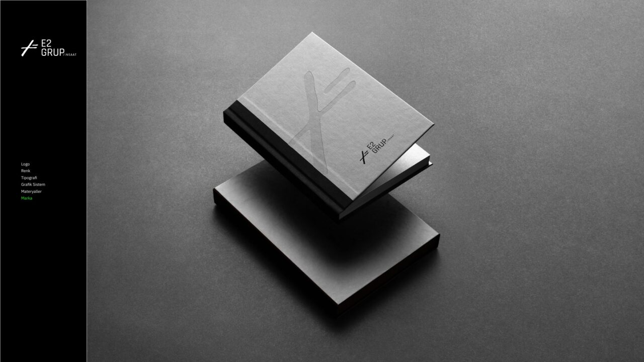
How to create brand guidelines (a brand book)
Brand guidelines are the rulebook that makes an identity look the same no matter who applies it or where. Good guidelines are short, clear and full of examples.

Why are brand guidelines needed?
A brand's visuals are often produced by different people: the internal team, agencies, printers, the social media manager. Without shared rules, each uses the logo at a different size, color and layout. Guidelines prevent this and save time on every new piece.
What should the guidelines include?
Scope varies by brand, but basic guidelines cover:
- Brand summary: purpose, values, positioning
- Logo: versions, clear space, minimum size, misuse
- Color palette: HEX, RGB, CMYK and Pantone codes
- Typography: typefaces and size hierarchy
- Visual language: photography, illustration and icon rules
- Brand voice: tone, sample sentences, phrases to avoid
- Application examples: business card, social media, presentation, signage
Making guidelines usable
The best guidelines are practical, not long. Show every rule with a right and a wrong example. Share frequently used files (logo packs, templates) with the guidelines. Keep the document as an easy online page for the team as well as a PDF.
Keeping guidelines current
As the brand grows, new needs appear: a new social format, a new product range, a new sign. Reviewing the guidelines once a year and adding new applications keeps the identity from drifting.
Who should prepare the guidelines?
They are usually prepared by the agency or designer who created the identity, as they know the reasons behind the decisions best. But the people who will use them should be involved too: the social media manager, sales team and external designers can say where they struggle. This feedback keeps the guidelines from staying on paper.
Extra rules for digital channels
Today identities are used most in digital channels. The guidelines should have sections for:
- Social profile pictures and cover images
- Post and story templates
- Website colors, button and link styles
- Email signature and newsletter template
- Video intro and outro cards
Guidelines and brand voice
Next to visual rules, a brand voice section should be part of the guidelines. Form of address, tone, frequent phrases and sample copy keep every communication consistent, from social media to customer service. A brand that is visually consistent but speaks in different tones still looks scattered.
Are a brand book and a corporate identity manual the same thing?
The terms brand book, brand guidelines, brand usage guide and corporate identity manual are often used interchangeably in everyday language. Still, there is a difference in emphasis. A brand book is usually a document with a strong inspirational side that also tells the brand's story, values and personality. A corporate identity manual is more technical and application-focused: logo dimensions, color codes, signage and print material details. For many brands, the best solution is to combine both approaches in one document: a guide that opens with a short brand summary and then moves on to rules people can apply. When working with an agency, clarifying the scope you expect from the start ensures the delivered document meets your needs.
Steps to create brand guidelines
Brand guidelines are not a document written all at once after the identity design is finished. The decisions made during design need to be recorded along with their reasons and tested against real applications. Listing the channels where the brand will appear most often determines the priority sections of the document. At the draft stage, asking a few of the people who will use the guide to produce an application quickly reveals missing rules. A typical guide is prepared in these steps:
- Inventory of current uses and channels
- Writing the brand summary and key messages
- Defining logo, color and typography rules
- Preparing correct and incorrect usage examples
- Designing application examples
- Testing with the user team and final editing
- Delivery together with the file package
How do you write color and typography rules people can apply?
The most common gap in guidelines is that colors and typefaces are only listed, without explaining how to use them. In the color section, show the proportions in which primary and secondary colors are used, which background and text combinations are legible, and the differences between print and screen. In the typography section, define a size and line-spacing hierarchy for headings, subheadings and body text. Specify a fallback typeface for environments where the corporate typeface is not installed, and note who holds the font license. These sections should include:
- Color usage proportions
- Legible background and text combinations
- Heading and text size hierarchy
- Fallback typeface for presentations and email
- Font license information
Files to deliver with the guidelines
However well the guide is written, the rules cannot be applied without the right files. The printer needs vector files, the social media manager needs images with transparent backgrounds, and the web developer uses formats optimized for screens. Organizing files into folders by purpose and naming them clearly prevents the wrong file from being used. The delivery package should include:
- Logo: SVG, PDF and EPS vector files
- Logo: transparent PNG in several sizes
- List of color codes (HEX, RGB, CMYK, Pantone)
- Font files or license information
- Social media, presentation and document templates
- Icon set and graphic elements
Getting the team to adopt the guidelines
Even the best guide is useless if nobody opens it. For the guide to be adopted, present it to the team in a short introductory meeting instead of simply sending it as a file. Preparing the most frequently used rules as a one-page summary gives people a quick reference for daily work. Appoint a person responsible for the guide: before new designs go live or to print, this person should check them. Sharing the guide with new employees and external designers on their first day reduces later corrections. This way the guide stops being a document sitting on a shelf and becomes a daily working tool for the brand.
Example project: Intecro E-Mobility brand guidelines
The 35-page brand guidelines we prepared for Intecro E-Mobility have two parts. The first defines logo anatomy, clear space, minimum size, misuse, the color palette and Oxanium typography. The second shows corporate applications with measurements, from business cards to vehicle livery and from flags to promotional items. A guide like this keeps the brand consistent even when different suppliers apply it.
Frequently asked questions
Do small businesses need guidelines?
Yes. Even a few pages greatly improve consistency for small businesses working with different people.
In what format are guidelines delivered?
Usually as a PDF, together with logo packs, color codes and template files.
Is a brand book the same as brand guidelines?
In everyday use they usually mean the same thing. A brand book places more emphasis on the brand's story and values, while a corporate identity manual focuses on technical application rules.
Can guidelines be created later for an existing brand?
Yes. Current uses are gathered first and inconsistencies identified, then the rules accepted as correct are turned into a guide. Small corrections can also be made at this stage if needed.
How many pages should brand guidelines have?
There is no single correct page count. Scope depends on the channels the brand uses; a few pages can be enough for a small business, while brands with many applications need a more comprehensive guide.